Brand Identity
Art Direction
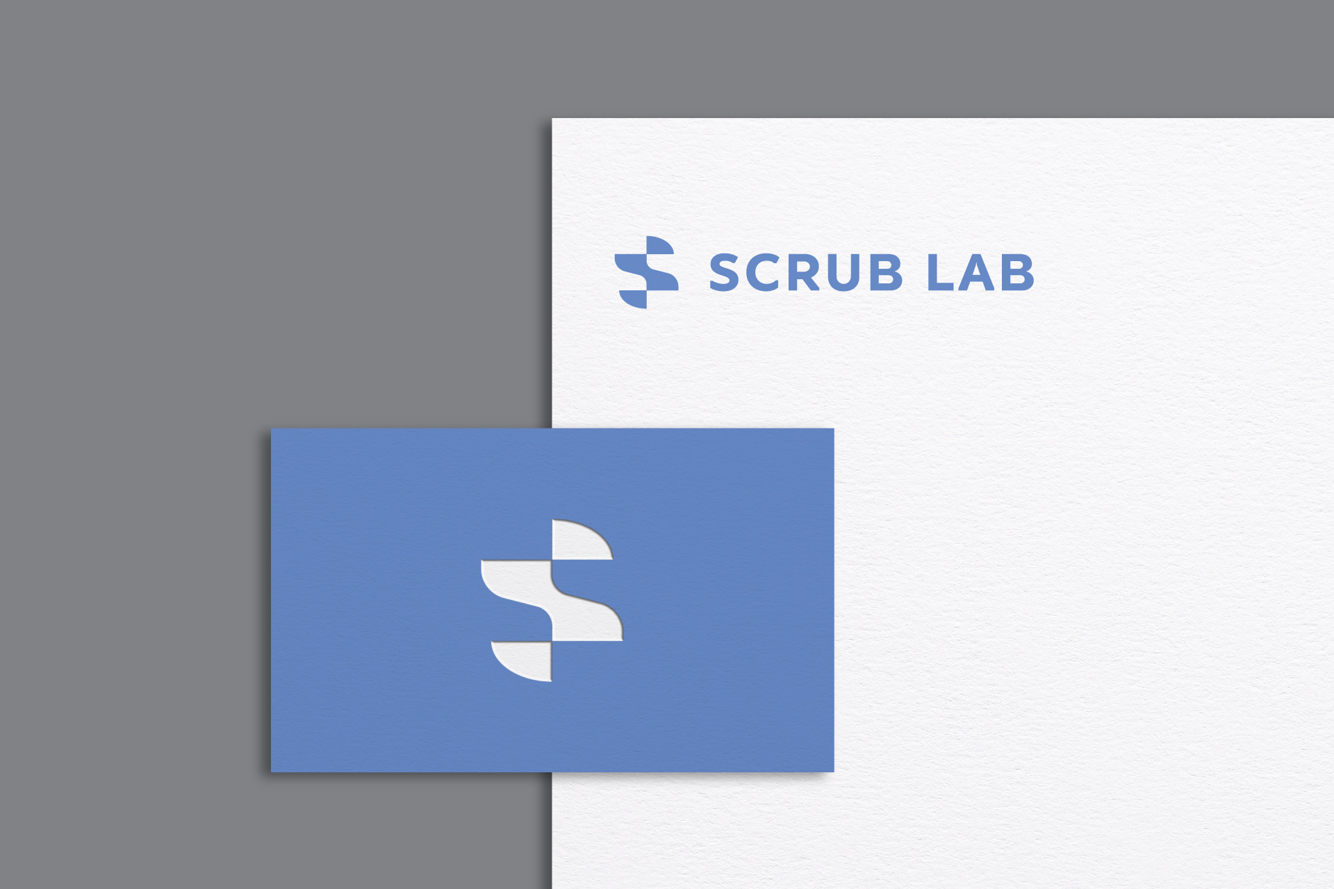
Logo Design
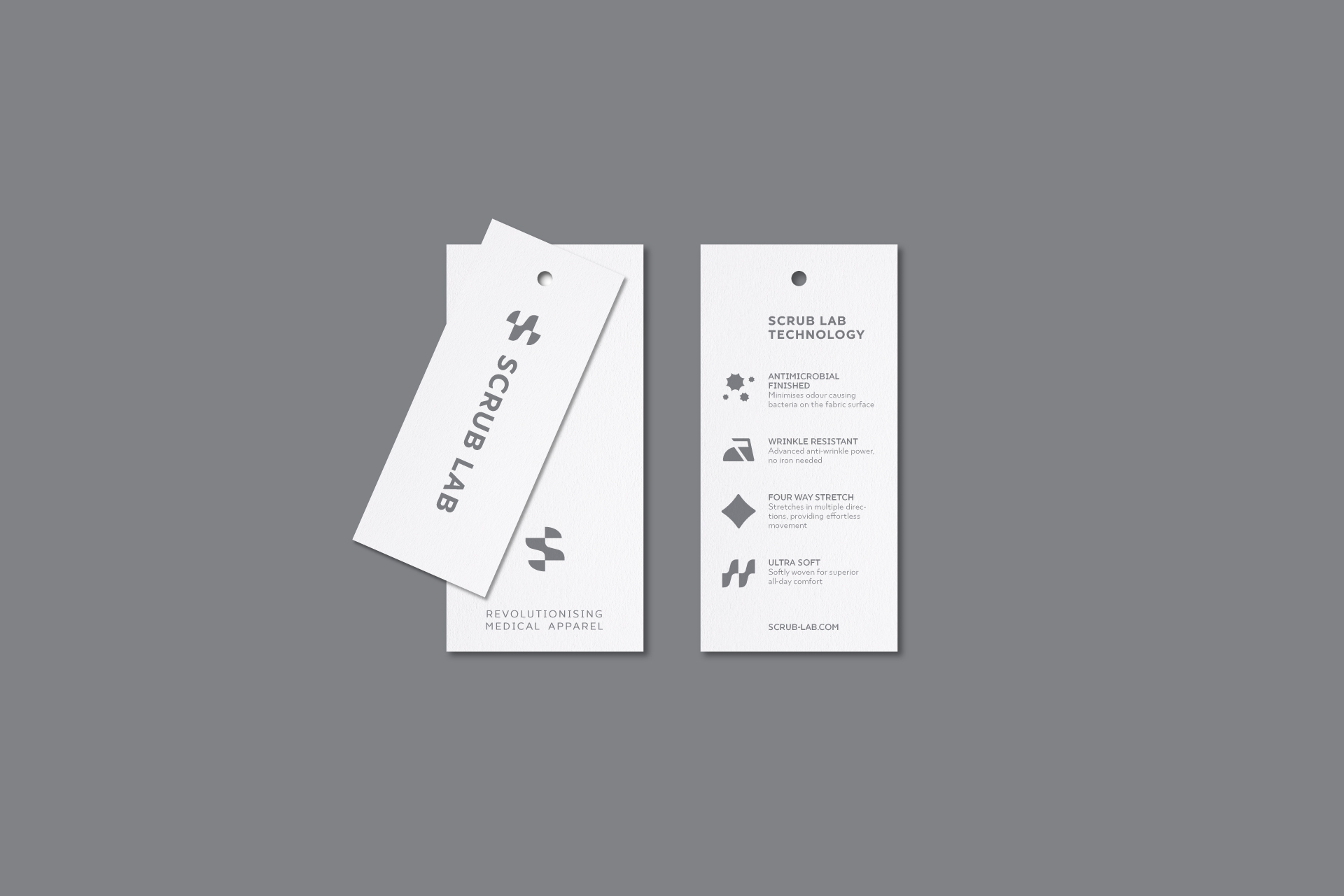
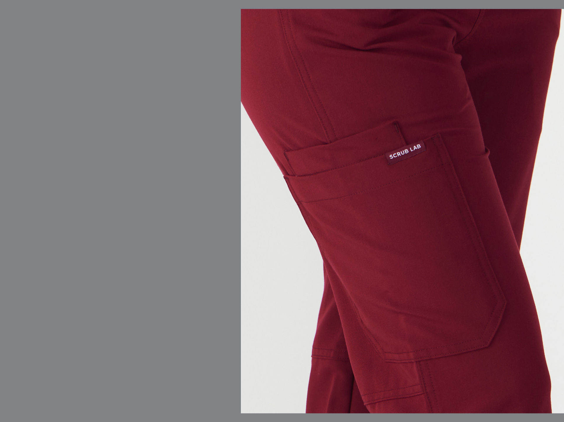
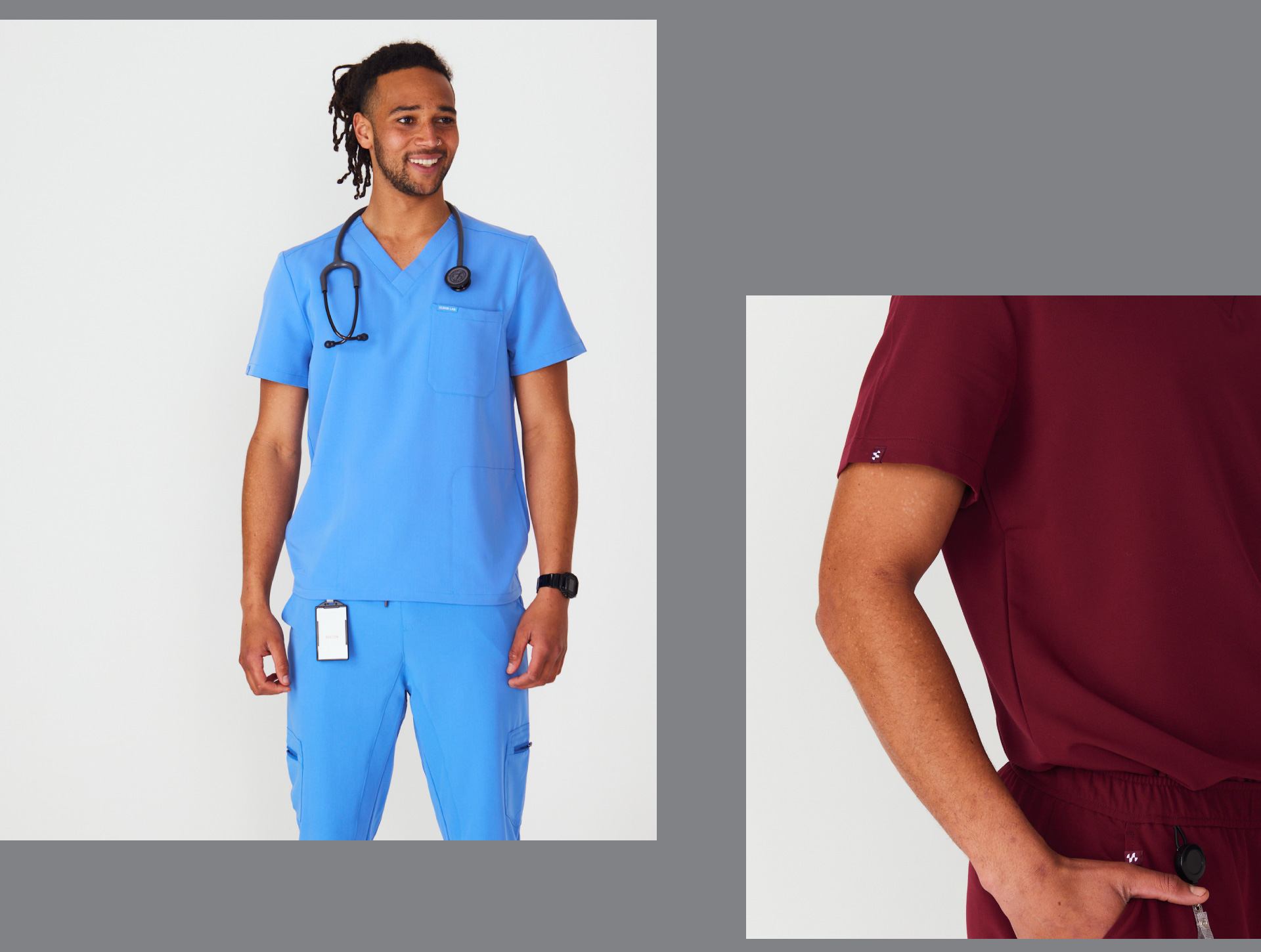
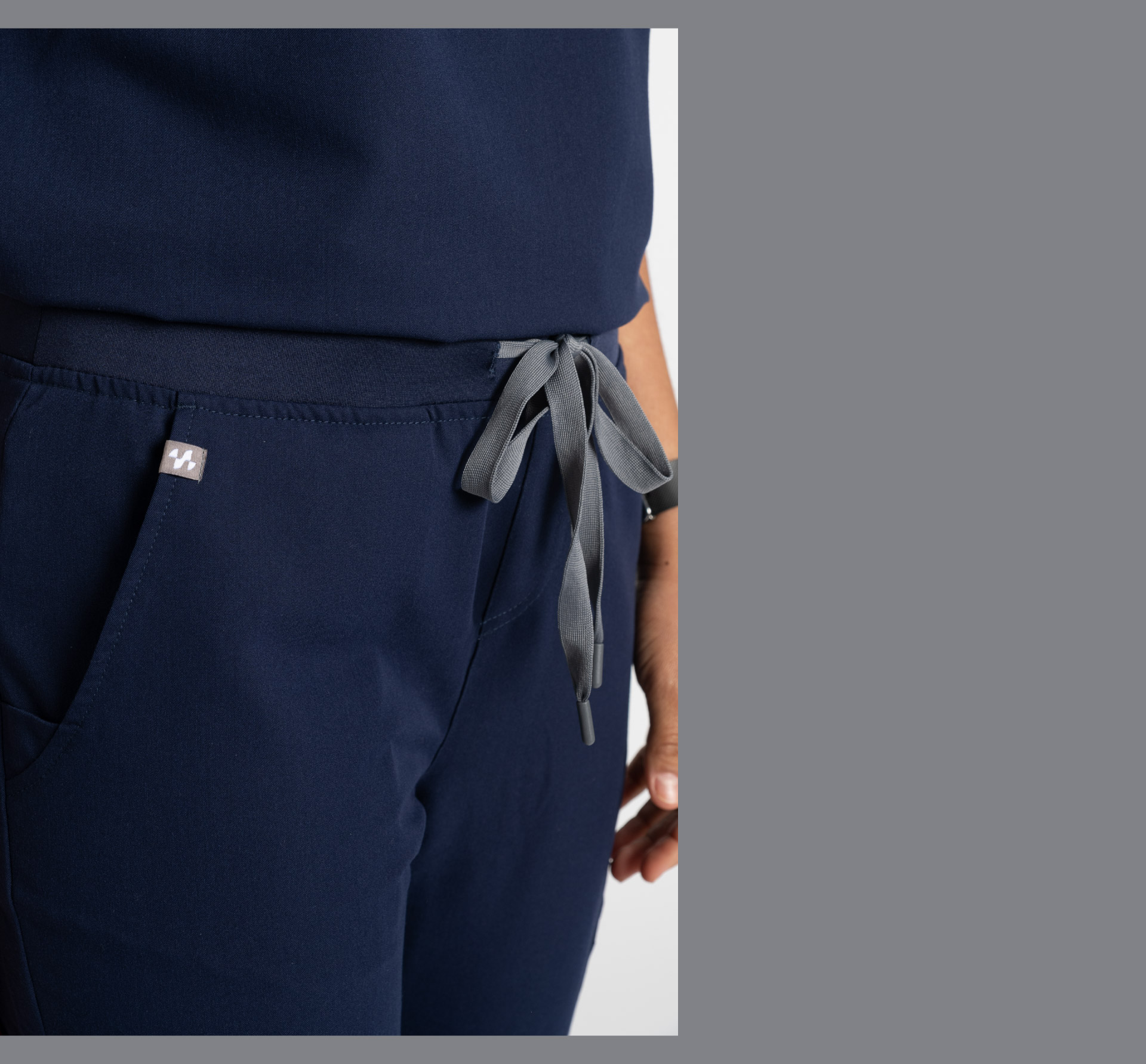
Clothing Label Design
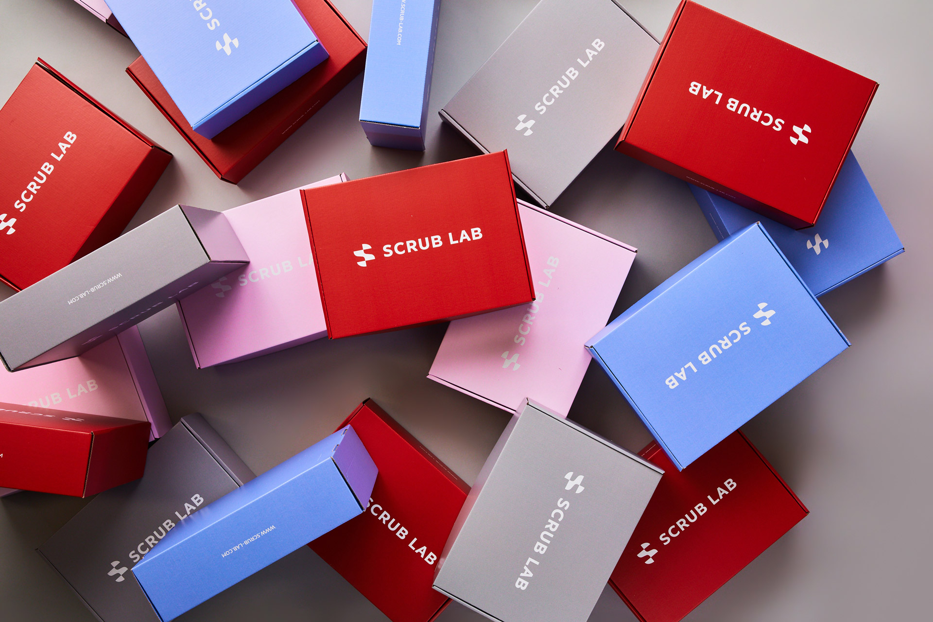
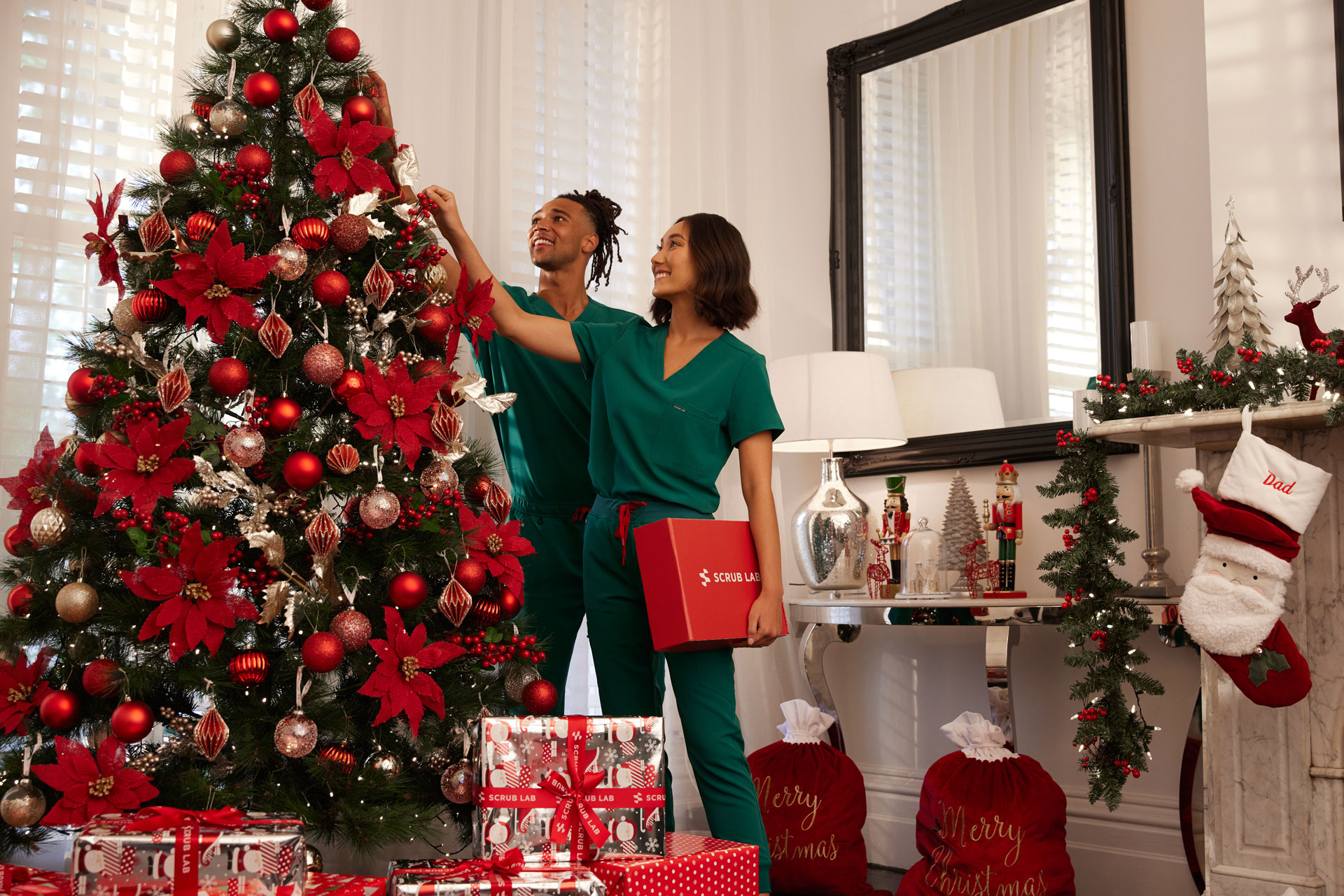
Packaging Design
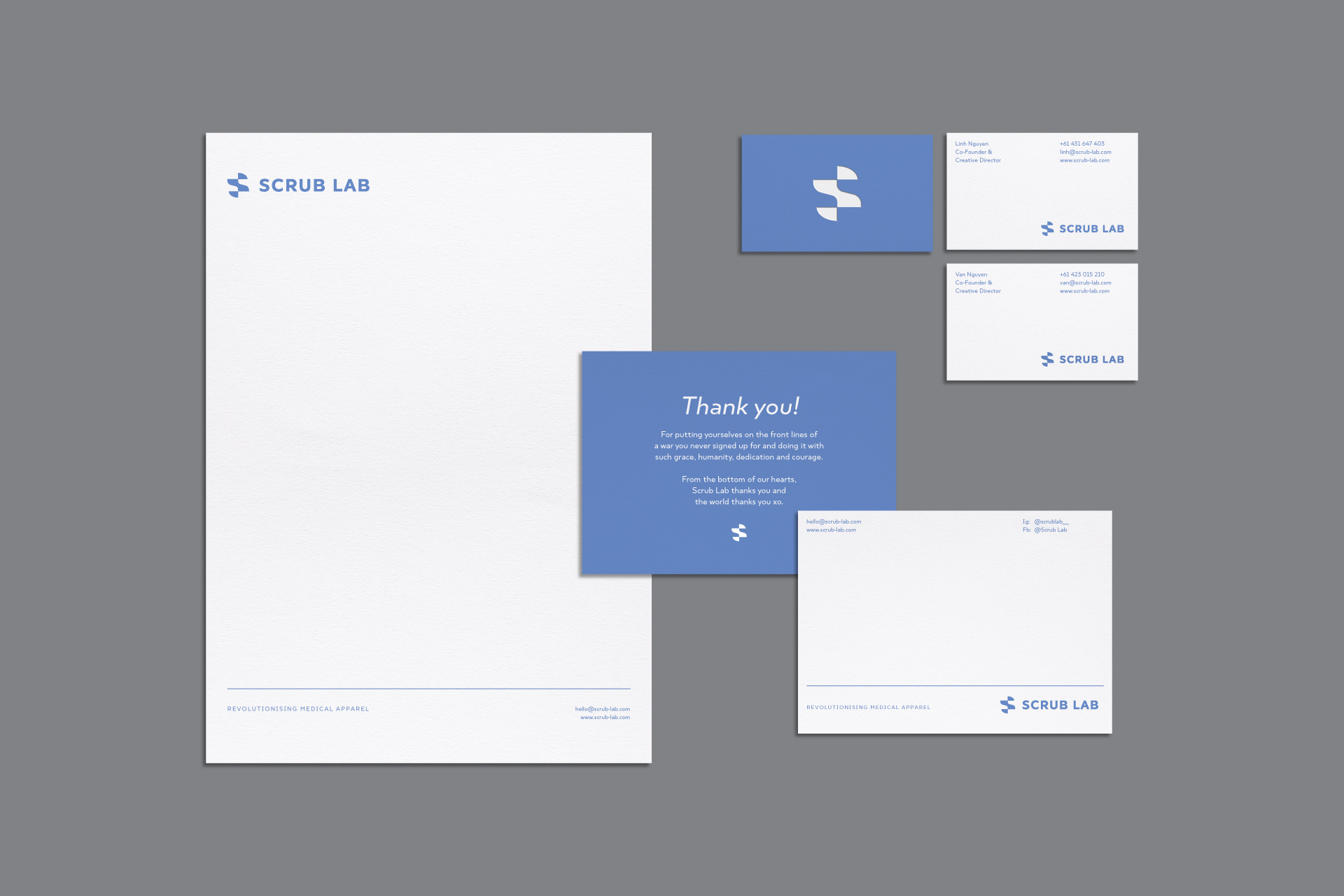
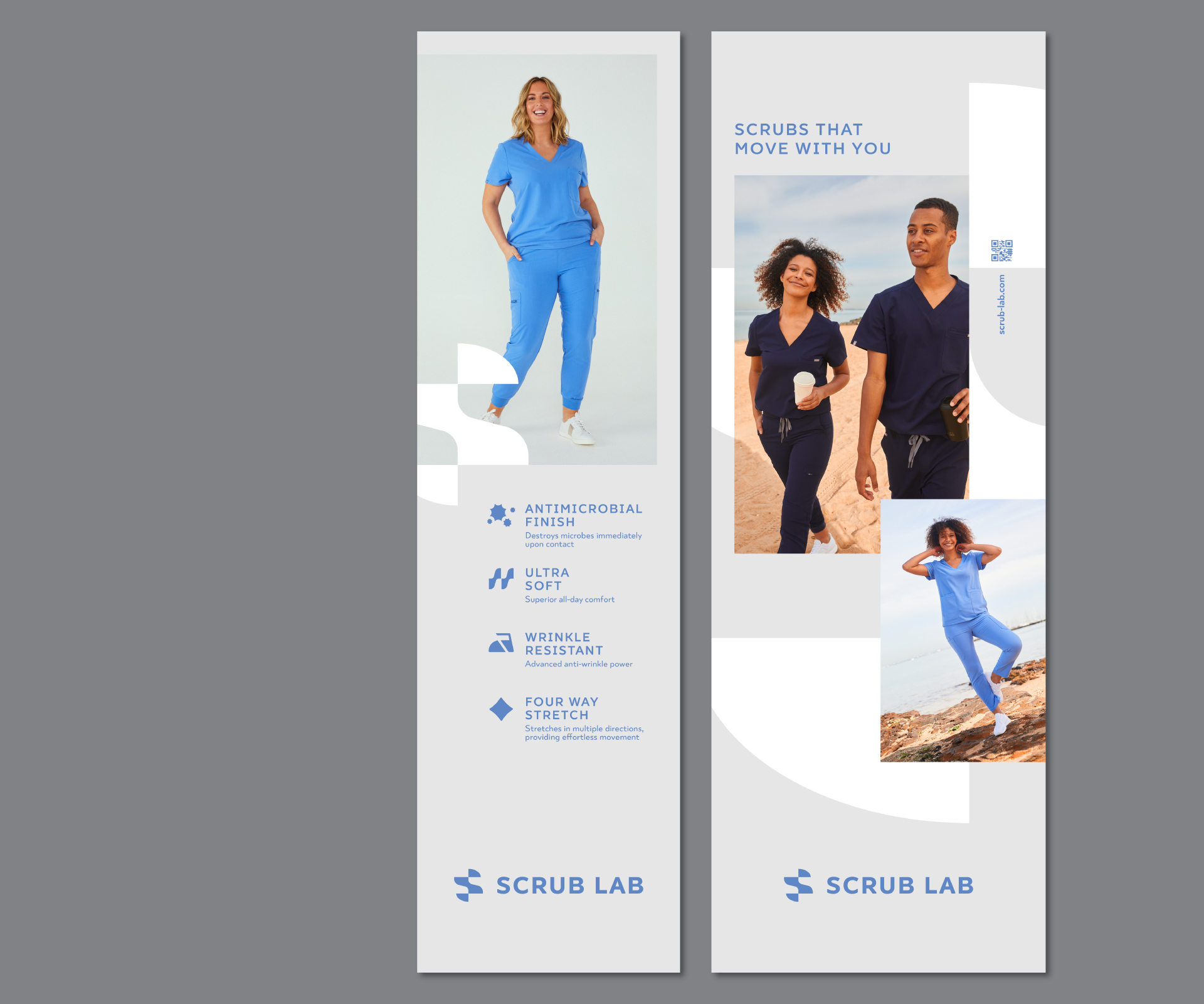
Print Collateral
Exhibition Graphic
–
2020
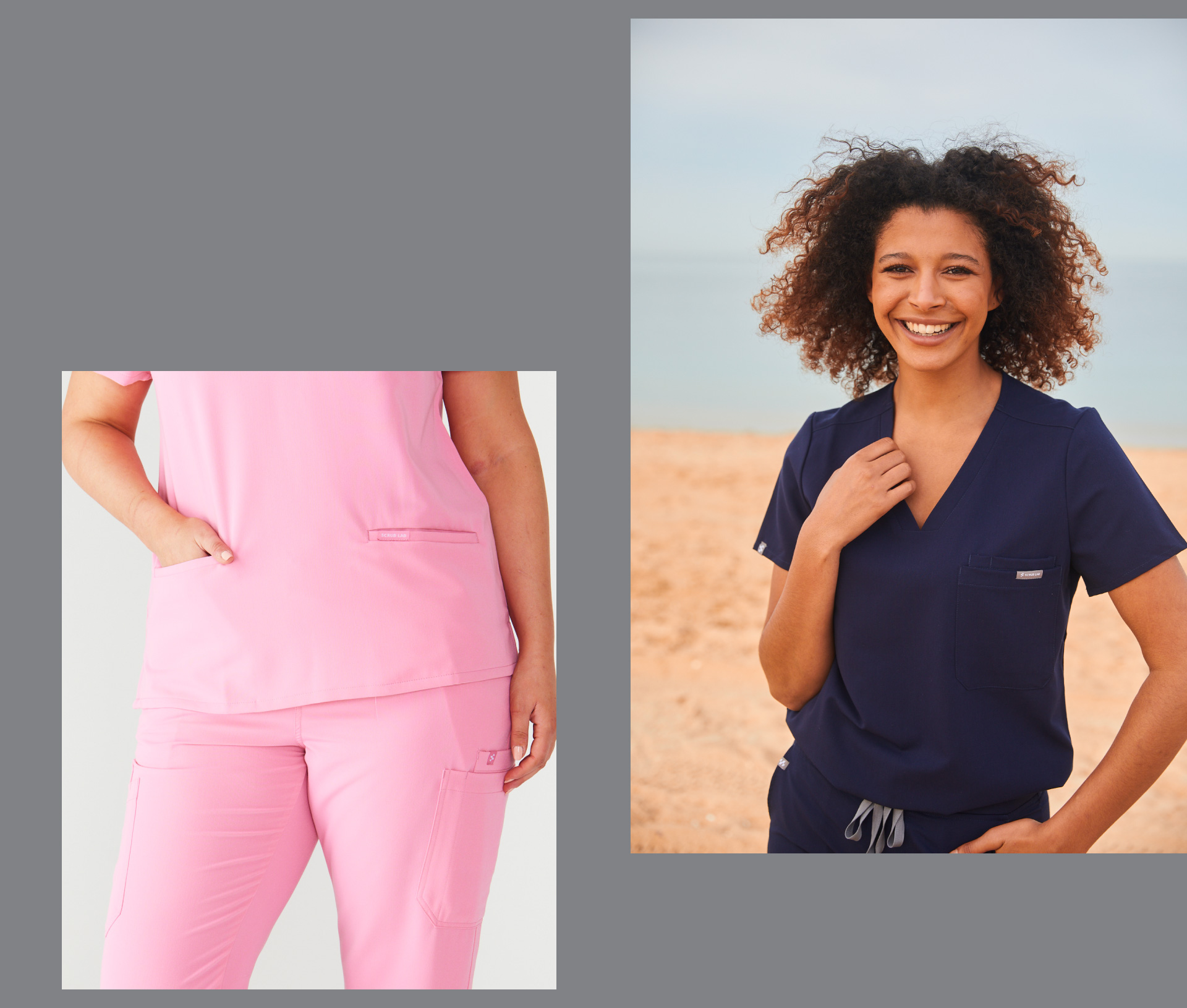
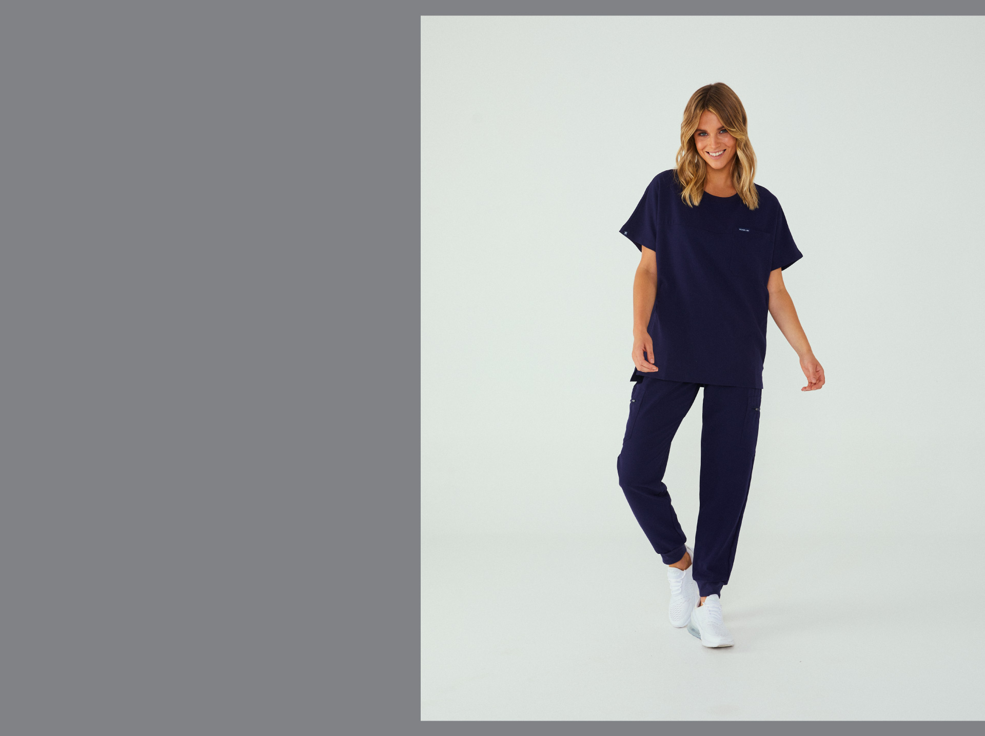
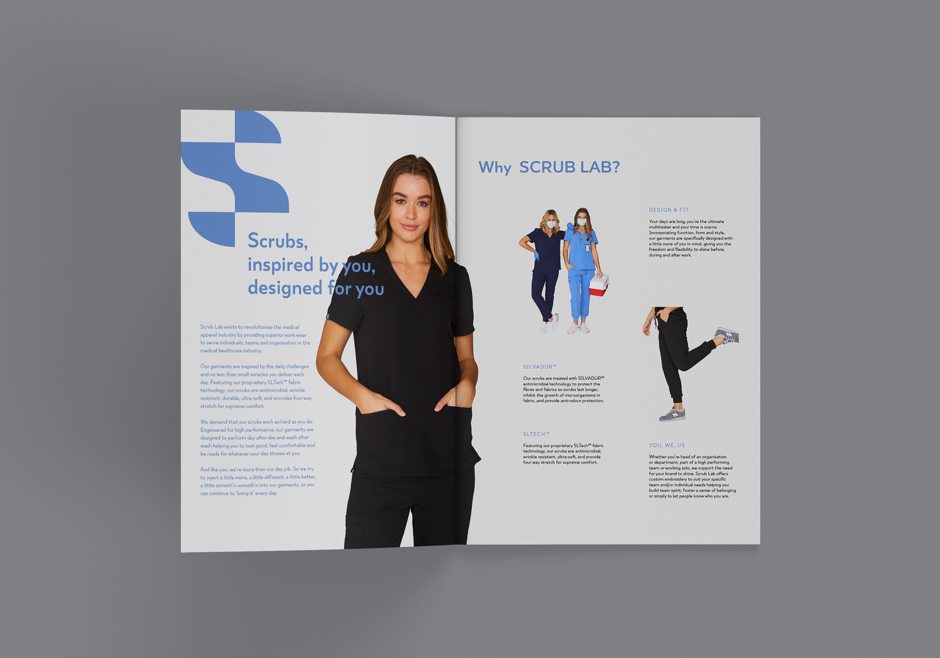
Founded by a sister duo / lady bosses Linh and Van, a qualified and practising Registered Nurse in search for comfortable and stylish scrubs in the market but could not find anything that matched her standards. She eventually approached her sister, Linh, a qualified accountant with a flair for fashion and creativity, and asked if she could help design her some scrubs.
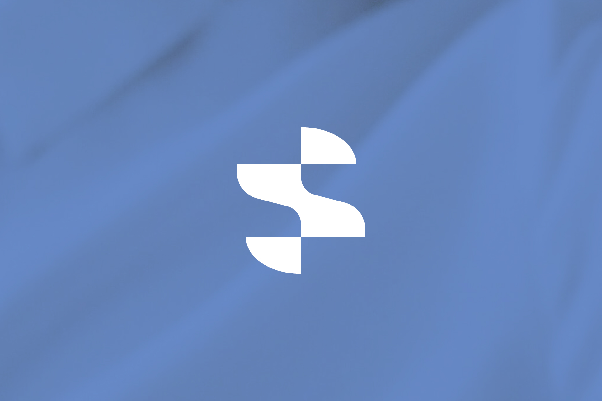
The logomark S has broad symbolic meaning, it is active, strong, confident and stylish. It also means 2 sisters when the logomark S in reversed. The logomark is bold and clear to be reproduced in small size and provides a point of difference and visibility in the medical wear space.
Brand Identity
Art Direction
Logo Design
Clothing Label Design
Packaging Design
Print Collateral
Exhibition Graphic
–
2020